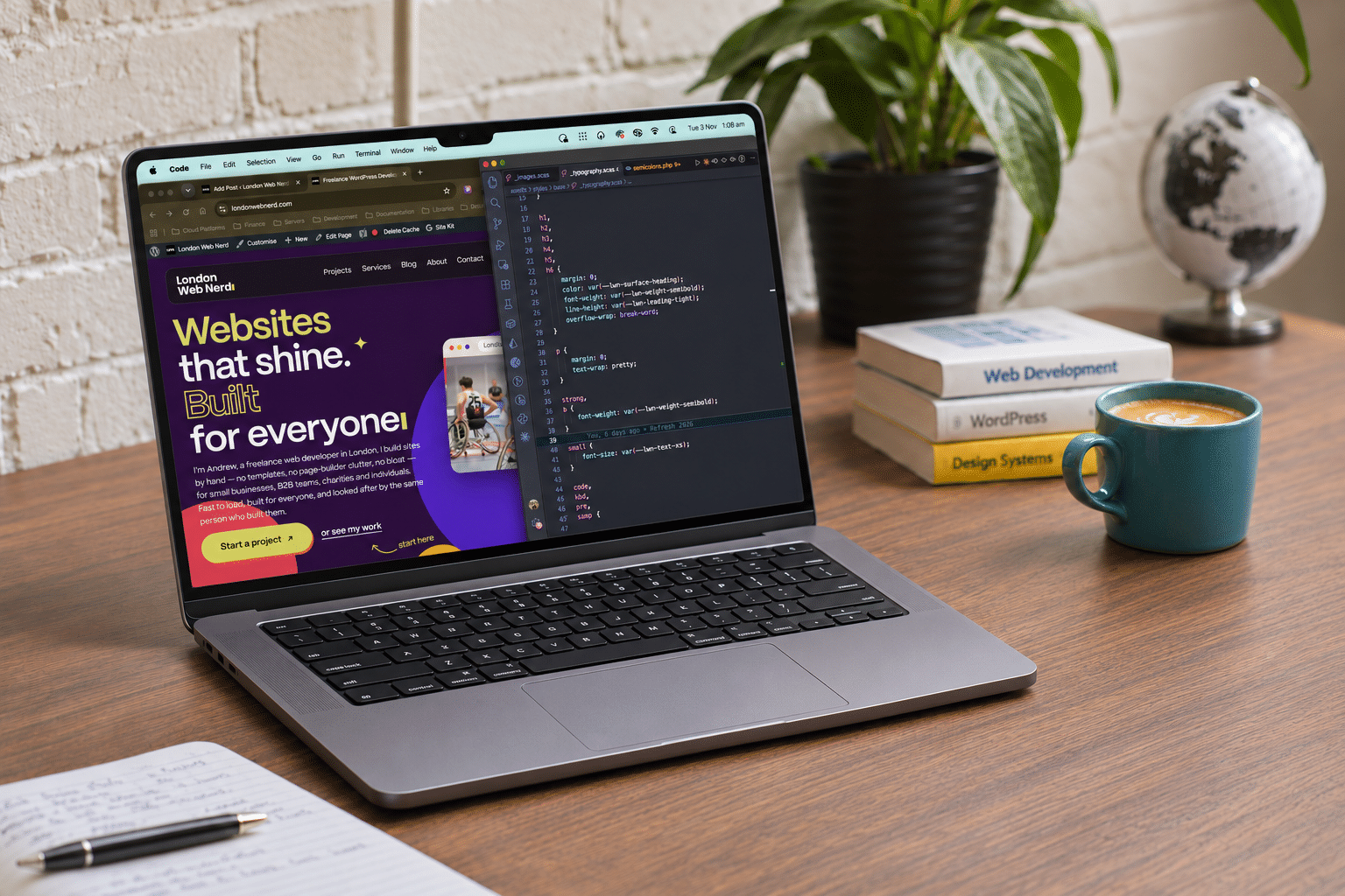
I’m Andrew, a freelance WordPress developer based in London. For years, London Web Nerd has been the name behind client sites that needed to work properly, load quickly, and not fall over the moment real traffic arrived. I design, build, and host websites for people who need something that works, not something that merely looks clever in a portfolio.
But here’s the thing nobody tells you about running a one-person web business: your own site is always the last one to get attention. I’d been putting every hour into client projects, and my website paid the price for it. It sat there, neglected, slightly out of date, slightly apologetic, while I fixed everyone else’s problems. The trouble is, my website isn’t just a marketing page. It’s my identity. It’s my brand. And once I acknowledged that, leaving it in that state was no longer an option.
What was wrong with the old site?
Nothing catastrophic. It still worked. It still brought in enquiries. But it no longer said what I wanted it to say.
The old site leaned too hard on web-industry language — the kind of phrasing that sounds impressive in a pitch deck but tells a small business owner nothing useful. Words like “bespoke” and “holistic” were doing a lot of work without saying much. Meanwhile, the actual value I offer — speed, accessibility, and one accountable person handling your project from first call to final launch — was buried under that noise.
There was also a practical problem. The site was slower than it should have been, which is a bit embarrassing when your entire pitch involves building fast websites for other people. If I’m going to tell a client their site needs to load quickly, mine has to prove it, right?
Why the refresh happened now
A few things converged at once.
First, I kept noticing a gap between how I actually work with clients- plain conversations, clear pricing, straightforward timelines- and how the website sounded. The tone was more corporate than I am. I don’t send tickets. I don’t disappear behind a support queue. You get a personal reply, and you get me.
Second, my client base had shifted. I was doing more work for small businesses, charities, and B2B teams who needed something properly built and properly accessible, not just something decorative. The old site was still speaking to a more general audience, when really I wanted to be specific about who I’m best suited to help.
Third, and honestly, this is the reason most freelancers will recognise. At some point I had to be straight with myself. My website is my identity. It’s my brand. It’s the first thing a potential client sees, and it was sitting there neglected while I focused exclusively on everyone else’s projects. That had to change. Once you see it that clearly, the project tends to happen fairly quickly.
The questions I asked before touching a single page
Before redesigning anything, I sat down with the same questions I’d ask a client:
- Who is this site actually for?
- What does someone need to know in the first ten seconds?
- What’s getting in the way of that?
- What can be cut entirely?
That last question did most of the heavy lifting. A lot of the old copy wasn’t wrong, exactly; it was just unnecessary. Paragraphs that explained what a website is. Sentences that padded out a point that was already clear. Once I started cutting, the site got shorter, faster, and considerably easier to read.
I also asked myself a harder question: who is this site not for? Being honest about that helped sharpen everything else. London Web Nerd isn’t trying to be the right fit for every possible client. It’s built for people who want one accountable developer, clear pricing, and a site that’s accessible from the ground up — not a big agency with account managers and a six-week onboarding process.
What changed in the rebuild
The structure changed, the copy changed, and the priorities changed.
Speed came first. A faster site isn’t a nice extra; it’s the whole point when you’re selling speed as part of the service. I rebuilt the site on the same principles I use for client projects: lean code, properly optimised images, and hosting configured by me, not left on autopilot.
Accessibility was built in, not bolted on. This matters more than most website refreshes admit. Accessible design isn’t a checkbox at the end; it shapes colour choices, navigation, and how content is structured from the start. I wanted the site itself to demonstrate that approach rather than just claim it.
The language got plainer. Jargon came out. Specific, honest statements went in. Instead of vague claims about quality, the site now says what it actually offers: fixed-scope proposals, transparent pricing, and one person handling your project from first message to launch day.
The audience became clearer. The new site speaks directly to individuals who need a solid personal or small business site, to B2B teams that need something properly built and maintained, and to charities who need accessible, dependable websites without agency overheads.
What London Web Nerd stands for now
The refreshed site reflects what London Web Nerd has quietly been about all along: fast, accessible, properly built WordPress websites, delivered by one person who stays involved after launch.
No ticket systems. No handovers between departments. No jargon soup. Just a clear process: scope, timeline, price, and a developer who actually answers when something goes wrong.
That’s not a flashy pitch, and it isn’t meant to be. It’s an honest one.
If your own site feels a bit like my old one did- slightly out of date, slightly apologetic- I’d be glad to help!. Send over your project, your tired old site, or your mysterious WordPress gremlin. You’ll get a personal reply, not a ticket number.
Let’s work it out together.