Introduction
JAS Land Rovers: Joe and Steph Land Rovers is Yorkshire’s number one independent Land Rover and Range Rover specialist. They serve York, Hull, Driffield, Selby, Malton, Beverley and the towns in between, offering drivers a skilled, honest alternative to the main dealer network.
Over the years, JAS built a strong reputation the hard way: through good work, fair pricing, and a genuinely family-friendly way of running a garage. Customers kept coming back. Word kept spreading. But the brand representing all of that hadn’t grown with them.
The problem
Everything JAS had — the logo, the website, the brand materials — had been created in-house. That’s a common starting point for a growing business. It’s rarely the right long-term one.
As the business matured, the gap became obvious. The paper brand didn’t reflect the standard of work happening in the workshop. A professional rebrand was needed, and it came with two specific constraints:
- Keep the recognisable elements of the existing mark. Customers already knew JAS. The new identity needed to build on that recognition, not discard it.
- Avoid the clichés of the industry entirely. Land Rover specialists tend to lean on the same handful of logo styles and visual tropes. JAS needed something that looked like nobody else on the high street — and an original colour palette to match.
No jargon, no generic off-the-shelf badge. Just a brand that actually looked like JAS.
The solution
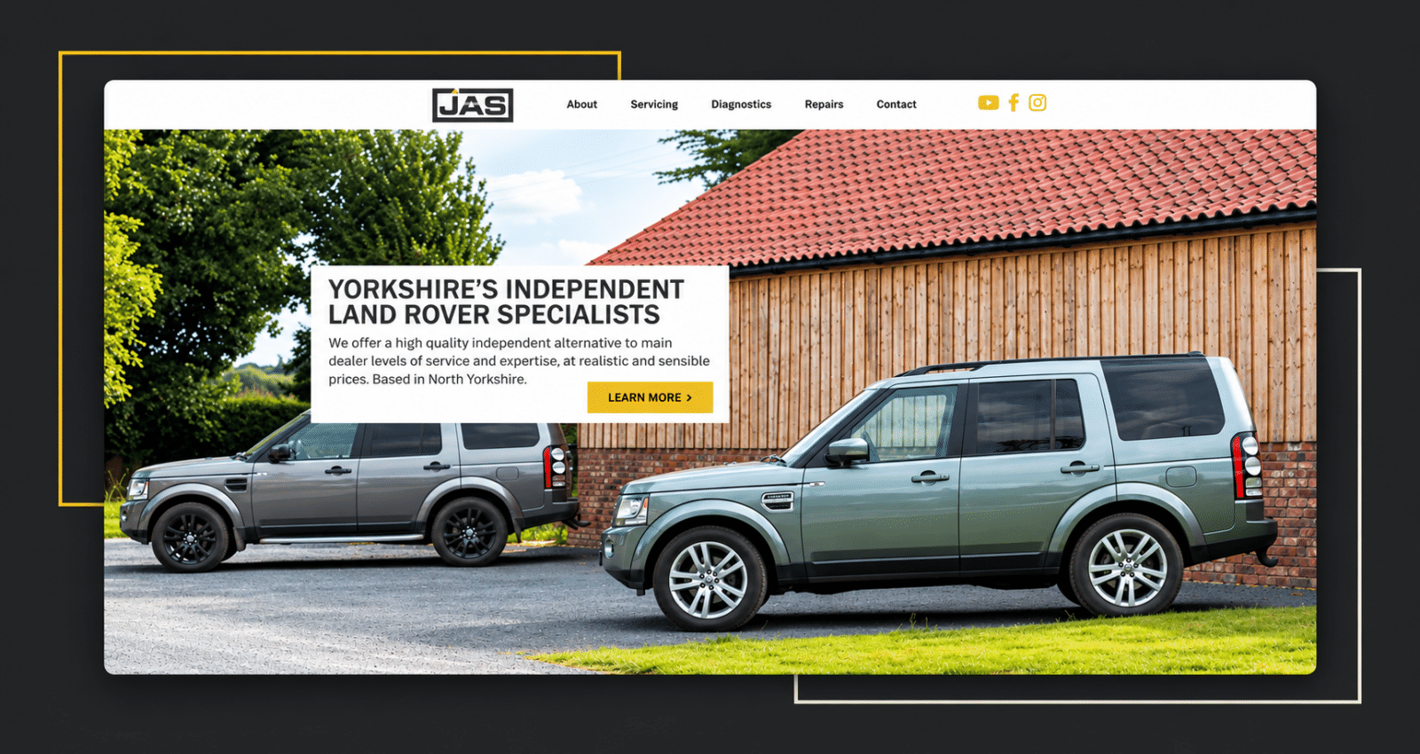
Louis White handled the imagery and logo design, the visual identity that gave JAS its own distinct look. I built the website from scratch: a fresh WordPress build, configured and launched to carry that identity forward.
The new logo kept the elements customers already associated with JAS, while standing entirely apart from the usual Land Rover-style branding found across the industry. An original colour palette followed: dark charcoal, white, warm yellow accents — built to set JAS apart rather than blend into the sea of familiar greens and silvers.
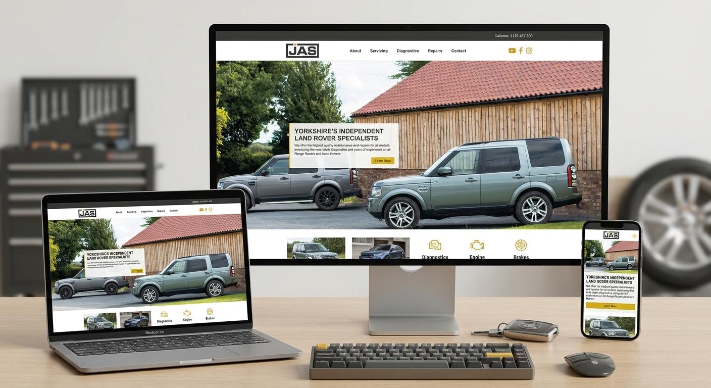
With the brand positioning settled, the work extended outward. The website carries that identity across desktop, laptop, and mobile, responsive by design rather than as an afterthought. Print collateral followed the same rules, consistent with the new look everywhere it appeared. Every piece said the same thing about JAS: highly skilled, premium yet affordable, properly family-friendly.
Two specialists, one joined-up result. Louis White owned the imagery and logo design. I owned the WordPress build, start to finish.
Conclusion
JAS Land Rovers now has a brand that matches the business behind it: skilled, approachable, distinct from every other Land Rover specialist on the road. Louis White’s imagery and logo design gave them an identity they can be proud of — a colour palette that’s properly their own, a mark that stands apart from the usual industry look. I built the website from scratch to carry that identity forward across every page.
The relationship between JAS, Louis White and me continues, with the brand foundation now in place to support further growth across Yorkshire and beyond.
Curious what a proper rebrand could do for your business? Get in touch to start the conversation.